One QR code for a whole restaurant.
Karta is a two-sided platform: guests scan the sticker on their table to order and pay in their own language with no app, and owners get a full back office that runs the floor and splits every payment automatically.
01 — The problem
A restaurant runs on a dozen disconnected tools. The guest feels every seam.
Paper menus that can’t be translated. A card terminal that walks to the table. A waiter chasing the bill. Allergens nobody can look up. Tips that feel awkward. And a POS that doesn’t talk to any of it — so every busy service leaks time and turns tables slower.
- ✕ Guests wait to order, then wait again to pay
- ✕ No translation, no allergen info at the table
- ✕ Splitting a bill and tipping is clumsy
- ✕ Owners reconcile kitchen, bar and tips by hand
- ✕ “Install our app” is a non-starter for a walk-in
02 — Product thinking
Three bets that shaped the platform.
Zero friction for the guest
No app, no login, no download — a scan opens the menu in their language. Meet people where they already are: their phone browser.
One payment, correctly split
A single guest tap settles the bill and auto-routes money to kitchen, bar and tips — so the owner never reconciles by hand.
Two audiences, one system
The guest app and the owner back office share a design language and data model, so the whole platform stays coherent.
03 — Two sides of one product
The hardest part was serving both at once.
A guest wants speed and calm on a phone. An owner wants control and clarity on a screen full of numbers. One system had to do both.
Fast, calm, in your language
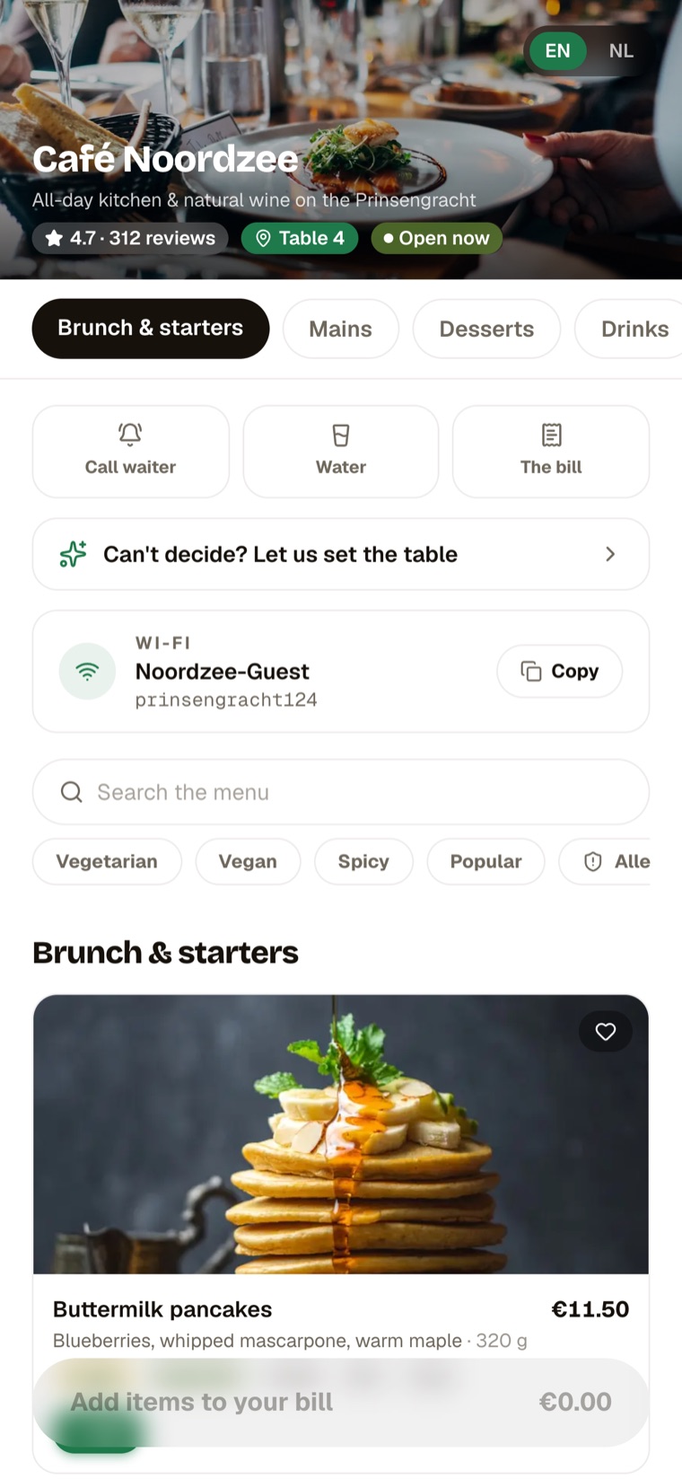
- Scan the sticker → menu in seconds
- Browse, filter, read allergens
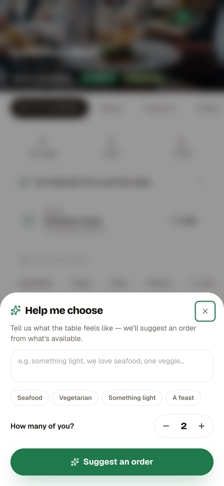
- “Help me choose” AI waiter
- Order, split and pay in a tap
Control, in one place
- Live floor plan and open tables
- Menu editor and QR stickers
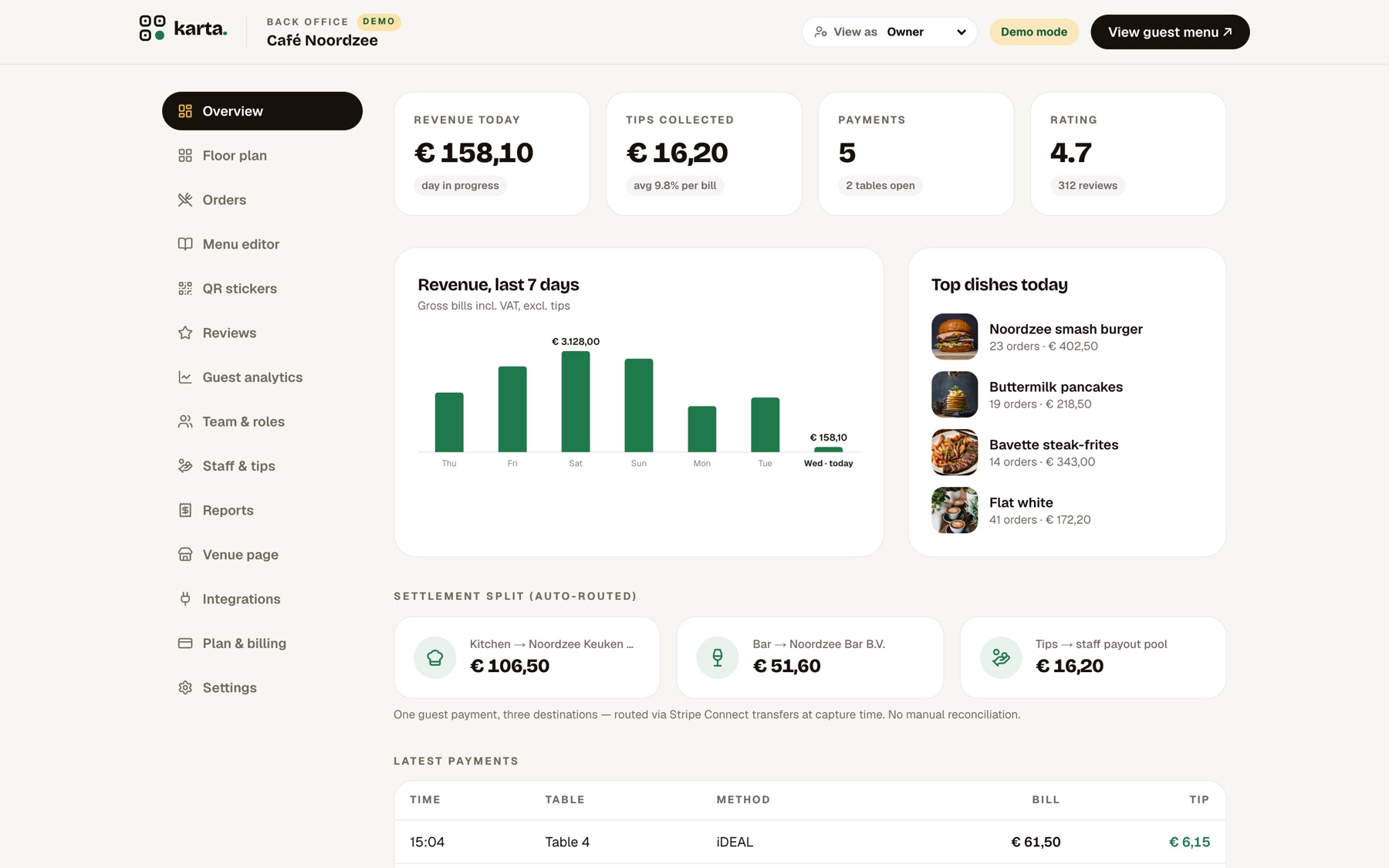
- Revenue, tips and top-dish analytics
- Auto-routed settlement, no reconciliation
04 — Who it’s for
Personas on both sides of the table.
Grounded in Karta’s two audiences — and the design bets behind them.
The diner
Maybe a tourist who doesn’t read the local language. Won’t install an app for one meal. Success = ordering confidently and paying without flagging anyone down.
The operator
Runs a busy floor on thin margins. Won’t rip out their POS. Success = tables turn faster, tips go up, and settlement just reconciles itself.
- “
The single biggest drop-off risk is any hint of a download — so the guest flow assumes scan → menu, instantly.
- “
Owners won’t adopt anything that means manual reconciliation — so the split is designed to be invisible and trustworthy.
- “
The bets to prove out next: higher tips and faster table turns from fewer, quicker interactions.
05 — Key UX & UI decisions
Where it became a real product.
The menu opens before you’d finish typing a URL
Scanning the table sticker drops the guest straight into a branded, photo-rich menu — language auto-detected, allergens and dietary filters one tap away, table already known. There is no account and no install between hungry and ordering.
An AI waiter for “I can’t decide”
Tell Karta what the table feels like — “something light, we love seafood, one veggie” — and it suggests an order from what’s actually on the menu. It turns choice paralysis into a one-sentence conversation.
The split is visible, so it’s trusted
The dashboard shows revenue, tips and — crucially — the settlement split routing money to kitchen, bar and the tip pool in real time. Making the invisible plumbing legible is what earns an operator’s trust in the numbers.
06 — Design system
One language across a phone and a control room.
Karta runs on a clean, light system with a single confident green, generous white space and photography that makes food the hero. The same tokens, type scale and components stretch from a calm, one-column guest menu to a dense, data-first owner dashboard — consistent, never repetitive.
Component language
- Menu cards
- Allergen chips
- Order sheet
- Split payment
- Floor plan
- Analytics tiles
- Settlement rows
- QR stickers
A shared system meant the guest app and the back office could be designed and built solo without the two sides drifting apart — one product, one voice.
07 — Outcomes
What shipped.
A working two-sided platform with a live demo. A couple of these are early goals, not yet measured.
08 — More