Source: https://imdennie.com/case/karta.html
Updated: 2026-10-08
Restaurant platform · Web · Founder product
# One QR code for a whole restaurant.
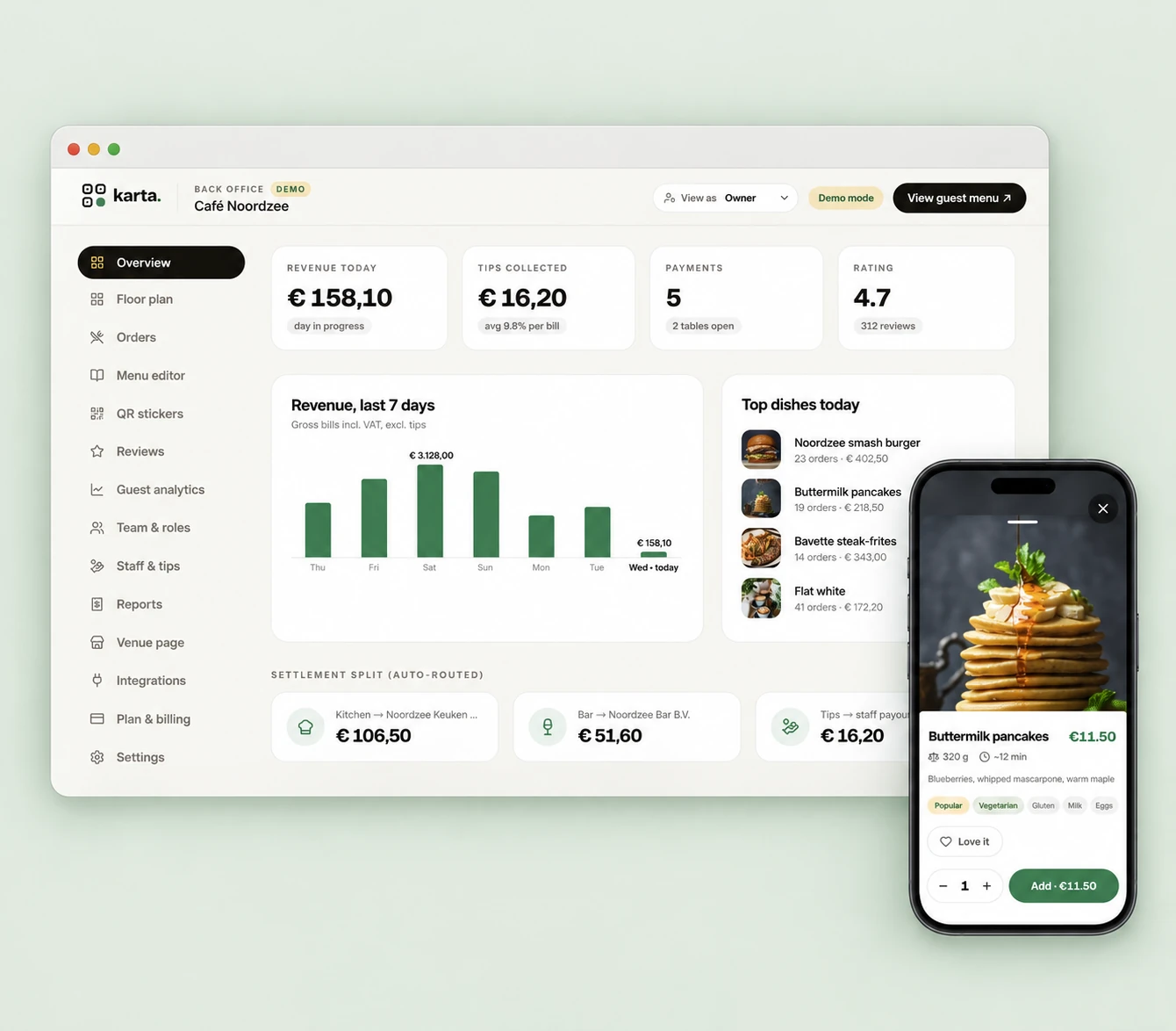
Karta is a two-sided platform: guests scan the sticker on their table to order and pay in their own language with no app, and owners get a full back office that runs the floor and splits every payment automatically.
- **Role** · Founder, Product Designer & Engineer
- **Timeline** · 2026 → public demo
- **Platform** · Web · guest + back office
- **Scope** · Two-sided product, end-to-end
- **Team** · Solo, with AI tooling
- **Status** · Working platform, public demo
[ Try the live demo ](https://karta-nu.vercel.app/) [How it was built ↓](https://imdennie.com/case/karta.html#build)
**01** — What I built and how I used AI
## Two apps, one system, one person.
Karta is a web platform with a guest ordering app and an owner back office. It has AI inside the product — the “help me choose” recommender — and it was built with AI-assisted development. Those are separate things, and this section keeps them apart.
My responsibility: Product definition for both audiences, UX and UI, the shared design system, the guest web app, the owner dashboard, the AI menu recommender, and the public demo.
Implementation: A mobile-web guest app and a desktop back office built as one web product with a shared design system and data model, deployed on Vercel. The guest menu needs no app or account; the dashboard shows the floor plan, menu editor, QR stickers, analytics and the settlement split.
AI-assisted development: AI coding tools wrote first implementations of screens, components and the recommender flow from my designs; the shared design system kept both surfaces consistent while generated code was reviewed and reworked.
My review and decisions: One system and data model for two audiences; which numbers an owner must see to trust the split; a guest flow with zero sign-up; what is in the demo and what is not; reviewing, changing and testing generated code.
Release status: Working two-sided platform with a public demo. The tips and table-turn figures in the outcomes are goals to prove with restaurants, not measured results. [Try the live demo](https://karta-nu.vercel.app/)
One build loop, start to finish
1. **Rough flow.** Scan → menu → order → pay on the guest side, and the owner’s view of that same order on the other.
2. **AI-generated first implementation.** AI coding tools produced the guest menu, the order sheet and a first dashboard from those flows and the design-system tokens.
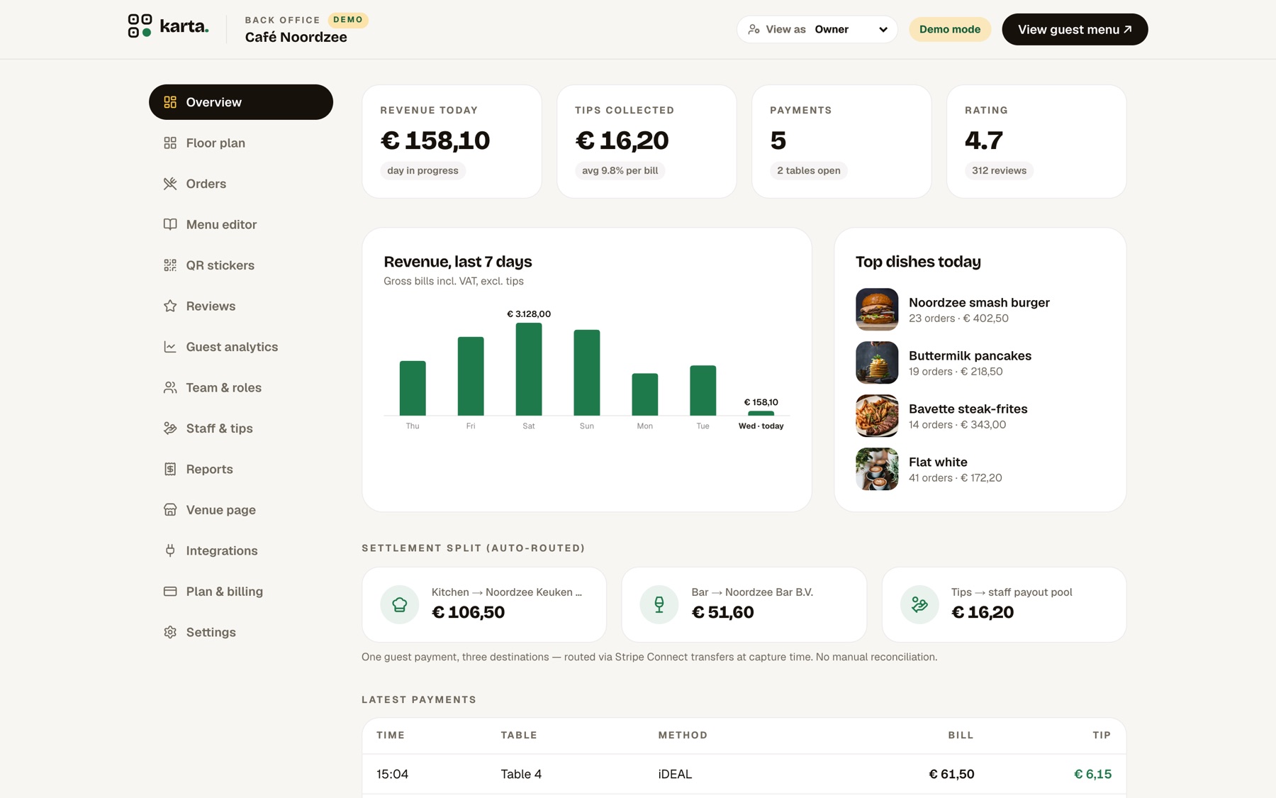
3. **What I decided.** A dashboard of totals is not enough — owners adopt a money tool only when they can see where every euro goes — so the settlement split to kitchen, bar and the tip pool is a visible, real-time row on the dashboard rather than hidden plumbing. On the guest side, nothing stands between scan and menu: no account, no install, language auto-detected.
4. **Working result.** In the demo a guest can scan, browse in their language, ask the AI waiter and put together an order; the owner dashboard shows revenue, tips and the settlement split.
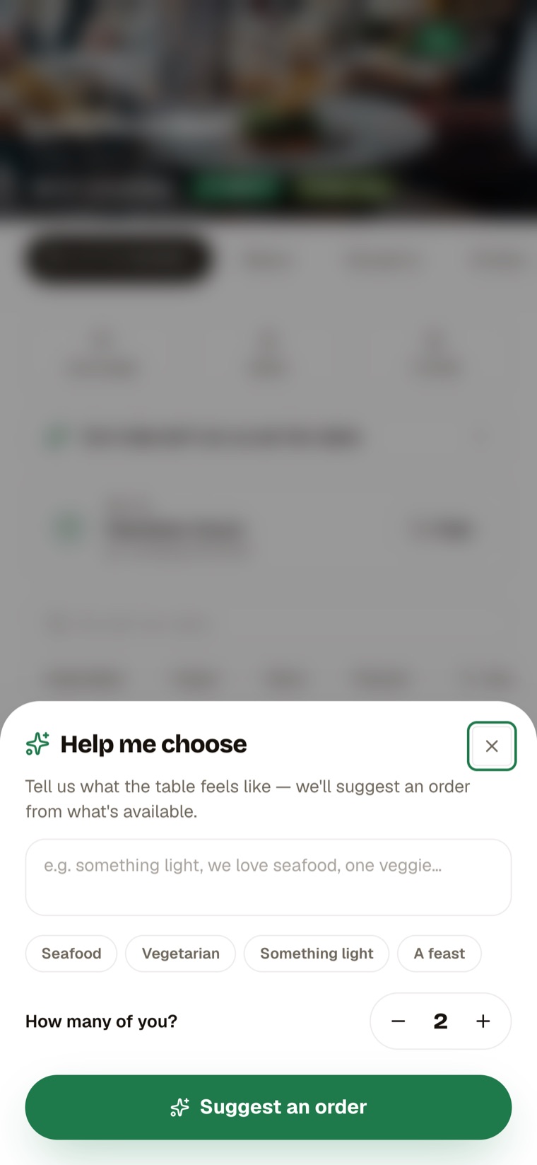
**A limitation I designed around:** an open-ended AI waiter will happily recommend a dish the kitchen does not serve. The recommender is constrained to the live menu, so a suggestion is always something the guest can actually order — and the chat is a one-sentence “help me choose”, not a general assistant.
**02** — The problem
## A restaurant runs on a dozen disconnected tools. The guest feels every seam.
Paper menus that can’t be translated. A card terminal that walks to the table. A waiter chasing the bill. Allergens nobody can look up. Tips that feel awkward. And a POS that doesn’t talk to any of it — so every busy service leaks time and turns tables slower.
- Guests wait to order, then wait again to pay
- No translation, no allergen info at the table
- Splitting a bill and tipping is clumsy
- Owners reconcile kitchen, bar and tips by hand
- “Install our app” is a non-starter for a walk-in
**03** — Product thinking
## Three bets that shaped the platform.
01
### Zero friction for the guest
No app, no login, no download — a scan opens the menu in their language. Meet people where they already are: their phone browser.
02
### One payment, correctly split
A single guest tap settles the bill and auto-routes money to kitchen, bar and tips — so the owner never reconciles by hand.
03
### Two audiences, one system
The guest app and the owner back office share a design language and data model, so the whole platform stays coherent.
**04** — Two sides of one product
## The hardest part was serving both at once.
A guest wants speed and calm on a phone. An owner wants control and clarity on a screen full of numbers. One system had to do both.
Guest · mobile web
### Fast, calm, in your language
- Scan the sticker → menu in seconds
- Browse, filter, read allergens
- “Help me choose” AI waiter
- Order, split and pay in a tap
Owner · back office
### Control, in one place
- Live floor plan and open tables
- Menu editor and QR stickers
- Revenue, tips and top-dish analytics
- Auto-routed settlement, no reconciliation
**05** — Who it’s for
## Personas on both sides of the table.
Grounded in Karta’s two audiences — and the design bets behind them.
#### The diner
Wants to eat, not fight the process
Maybe a tourist who doesn’t read the local language. Won’t install an app for one meal. Success = ordering confidently and paying without flagging anyone down.
#### The operator
Wants faster turns and clean books
Runs a busy floor on thin margins. Won’t rip out their POS. Success = tables turn faster, tips go up, and settlement just reconciles itself.
- “
The single biggest drop-off risk is any hint of a download — so the guest flow assumes scan → menu, instantly.
- “
Owners won’t adopt anything that means manual reconciliation — so the split is designed to be invisible and trustworthy.
- “
The bets to prove out next: higher tips and faster table turns from fewer, quicker interactions.
**06** — Key UX & UI decisions
## Where it became a real product.
Guest · onboarding
### The menu opens before you’d finish typing a URL
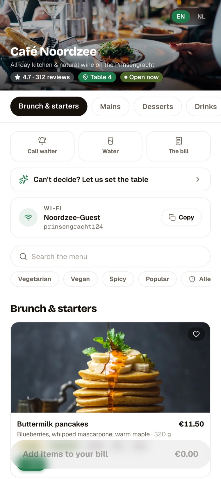
Scanning the table sticker drops the guest straight into a branded, photo-rich menu — language auto-detected, allergens and dietary filters one tap away, table already known. There is no account and no install between hungry and ordering.
**Why it works:** the moment of highest drop-off risk — “do I have to sign up?” — simply doesn’t exist.
Guest · AI
### An AI waiter for “I can’t decide”
Tell Karta what the table feels like — “something light, we love seafood, one veggie” — and it suggests an order from what’s actually on the menu. It turns choice paralysis into a one-sentence conversation.
**Why it works:** it recreates the best part of a great server — a confident recommendation — at every table, instantly.
Owner · back office
### The split is visible, so it’s trusted
The dashboard shows revenue, tips and — crucially — the settlement split routing money to kitchen, bar and the tip pool in real time. Making the invisible plumbing legible is what earns an operator’s trust in the numbers.
**Why it works:** owners adopt a money tool only when they can see exactly where every euro goes.
**07** — Design system
## One language across a phone and a control room.
Karta runs on a clean, light system with a single confident green, generous white space and photography that makes food the hero. The same tokens, type scale and components stretch from a calm, one-column guest menu to a dense, data-first owner dashboard — consistent, never repetitive.
Component language
- Menu cards
- Allergen chips
- Order sheet
- Split payment
- Floor plan
- Analytics tiles
- Settlement rows
- QR stickers
A shared system meant the guest app and the back office could be designed and built solo without the two sides drifting apart — one product, one voice.
**08** — Outcomes
## What shipped.
A working two-sided platform with a public demo. The first two are goals to prove with restaurants, not measured results.
+25%
Tips · goal
Faster
Payments & table turns · goal
0
Apps for guests to install
2
Audiences, one system
**09** — More
## Try the demo, or read another study.
[ Try the live demo ](https://karta-nu.vercel.app/) [All work](https://imdennie.com/#work)
[ Next case study Numi — AI nutrition ](https://imdennie.com/case/numi.html) [ Case study Tysha — baby sleep ](https://imdennie.com/case/tysha.html)